Analytics Strategy
5 Reasons Why Most Dashboards Fail (And What to Do Instead)
Here's a pattern that plays out in almost every analytics organization: a data team spends weeks — sometimes months — building a dashboard. There's a launch meeting. Stakeholders nod along. Someone says "this is exactly what we needed."
And then, three months later, nobody opens it.
The dashboard didn't fail because the data was wrong or the design was bad. It failed because of something that happened long before a single chart was built. Dashboards are one of the highest-effort, highest-visibility deliverables in any analytics team's portfolio. They also have one of the highest failure rates. Here's why.
1. Business stakeholders didn't ask for it
This is the most common reason, and the most avoidable. Even when there's an obvious use case for a dashboard, if no one on the business side specifically requested it, they're unlikely to use it.
Think about dashboards the way product teams think about features: it's far easier to build something someone asked for than to convince someone they need something they didn't. When analytics teams build dashboards on their own initiative — however well-intentioned — they're taking on the entire burden of adoption. They become salespeople for a product they also built, and that's a losing position.
The fix: keep a running log of business stakeholder requests. When a particular analytical need comes up more than once across different stakeholders, that's your signal to build. You're not guessing anymore — you're fulfilling demand.
2. A dashboard was never the right deliverable
Even when the need is real, a dashboard may not be what stakeholders actually want. Before committing to weeks of development work, validate the format.
One of the most effective techniques is to create what I call a "deliverable MVP." Set up a scheduled SQL query that dumps data into a Google Sheet every morning. Share it with the relevant stakeholders and tell them to use it. If they're actually opening it and acting on it two weeks later, then — and only then — is it worth upgrading to a full dashboard.
This approach exposes two things: whether the stakeholders genuinely want the information, and whether they'll engage with it in a pull format. Both of those need to be true for a dashboard to have a long life.
3. It's not quite what they wanted
Stakeholders often struggle to articulate exactly what they need until they can see something. You can do the best requirements gathering in the world and still build the wrong thing, because they didn't know what they wanted until they saw what they didn't want.
The solution is to make dashboard development iterative from the start. Build a Version 0 — rough, incomplete, clearly a work in progress — and get it in front of stakeholders before you've invested in clean design or polished logic. Collect their feedback, incorporate it into Version 1, and repeat. The goal of Version 0 isn't to impress anyone; it's to surface misalignment early, when it's cheap to fix.
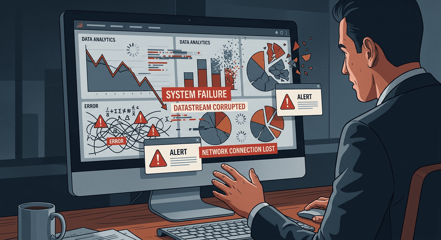
4. One metric "looks off" and it destroys confidence in everything
This one is subtle but devastating. When you present a dashboard as a finished product and a single metric is off — even by a small amount, even for a legitimate reason — it plants doubt in every other number on the screen. Stakeholders stop trusting the data, and once trust is lost it's very hard to recover.
The Version 0 approach solves this too. When stakeholders know they're looking at a work-in-progress, they're in problem-solving mode, not evaluation mode. "This number looks wrong" becomes a collaborative debugging session rather than a verdict on your work. Fix the issues together before you ever call something Version 1, and you'll preserve the credibility of the final product.
5. It generates information, not insight
This is the deepest problem, and the one most analytics teams never address. A dashboard is an information machine. It aggregates metrics across dimensions and presents them for consumption. But information isn't the same as insight — and insight is what drives decisions.
Insights require synthesis. Someone has to look at the numbers, notice a pattern or an anomaly, and connect it to a business implication. That synthesis is cognitive work that happens in people's heads, not on the screen — and if it's never captured anywhere, it evaporates.
The highest-performing analytics teams build a second layer on top of their dashboards: a curated knowledge base where insights are documented over time, complete with screenshots (which are snapshots of information at a specific moment) and the associated business context. This transforms a dashboard from a passive reporting tool into an active contributor to organizational learning. New team members can onboard faster. Recurring patterns get recognized across quarters. The business builds collective knowledge instead of rediscovering the same things year after year.
The underlying thread
Look at these five failure modes and you'll notice a pattern: most of them are rooted in process and communication, not technology. Better BI tools won't fix a dashboard nobody asked for. More data won't rescue a chart that's lost stakeholder trust.
The teams that get this right treat dashboard development like product development — with discovery, prototyping, iteration, and adoption tracking. They validate demand before they build. They make feedback part of the process. And they invest in turning the information their dashboards generate into something more durable: business knowledge.
What to do after launch
Most analytics teams put all their energy into building and launching a dashboard, then move on to the next request. That's a mistake. The post-launch period is when you learn whether the dashboard is actually working — and when you have the best window to rescue it if it isn't.
Track usage. Most BI tools have built-in usage analytics. Check who is opening the dashboard, how often, and which views they're spending time on. If usage drops off after week two, that's a signal worth investigating before the dashboard fully dies.
Schedule a 30-day check-in with the primary stakeholder. Not to show off the product — to ask honestly: "Is this changing how you make decisions?" If the answer is vague or lukewarm, dig into why. The most common answer is that the dashboard is showing the right data but not surfacing the right questions — and that's fixable with relatively minor changes.
The dashboards that survive long-term aren't necessarily the most technically impressive. They're the ones whose owners stayed engaged after launch.
The complexity trap
There's a sixth failure mode worth naming separately because it's often self-inflicted: over-engineering.
Analytics teams are rightfully proud of their technical skills. When given the opportunity to build a dashboard, there's a natural temptation to make it comprehensive — every metric, every filter, every possible cut of the data. The reasoning is sound: "We don't want stakeholders to have to come back and ask for more." The result is usually the opposite of what was intended.
Complex dashboards require orientation. When a stakeholder opens a dashboard with 12 tabs, 40 metrics, and a matrix of filter combinations, they don't see power — they see homework. The cognitive load of figuring out where to start is often enough to make them close it and ask someone on the data team instead.
The dashboards that get used are almost always the simple ones. A single view. A handful of the metrics that matter most. Clear labeling. A logical flow from the question to the answer. Build for the 80% use case, not the 100%. If there's a power-user use case that requires deeper exploration, build a second, clearly separated view for that — don't conflate it with the primary dashboard.
Simplicity isn't a limitation of the data team's skills. It's a design choice that makes the work more impactful. The measure of a great dashboard isn't how much it shows — it's how quickly it gets a stakeholder to a decision.
The real cost of the dashboard graveyard
There's a compounding cost to failed dashboards that rarely gets talked about: organizational trust. Every dashboard that launches with fanfare and goes unused teaches the business that analytical deliverables don't deliver. Stakeholders lower their expectations. They stop requesting work that won't get used. And the analytics team ends up in a vicious cycle — building things nobody asked for because they've stopped being asked for things, which leads to more unused deliverables, which further erodes trust.
The teams that escape this cycle don't do it by building better dashboards. They do it by rebuilding credibility one well-scoped, well-validated, actively-used deliverable at a time. That starts with applying the five principles above — but it also requires patience. Trust that was lost over a series of failed launches doesn't come back in a single quarter. It comes back through a consistent track record of delivering exactly what was asked for, validating that it's working, and iterating when it isn't.
That's a higher bar than most analytics teams set for themselves. It's also the bar that separates the teams that influence decisions from the ones that fill storage.
If your dashboards are gathering dust, the problem probably isn't the dashboard. Let's talk about what your team actually needs →